Visual Context & Iterative Refinement
Use screenshots and element selection to refine designs precisely.
📖 Lesson Content
From Draft to Demo
Your first page will never be perfect — and that's the point.
If you've ever given feedback on a design mockup ("make the cards bigger," "move the search bar up," "can we try a different chart?"), you already know how to use this module. The difference: instead of writing feedback in a Figma comment and waiting days, you tell @solar directly and see the result in seconds.
The refinement loop is the most important skill in this course. It's what turns a rough first draft into a polished, presentation-ready prototype.
Your Preview: The Simple Browser
When you create a project with @solar /initiate, a built-in browser panel opens inside VS Code. This is the Simple Browser — it shows your running app at localhost:5173.
Key things to know:
- It updates live as @solar makes changes — no need to refresh manually
- It lives inside VS Code, right next to your chat panel — no switching between apps
- If you accidentally close it, type
@solar /previewto reopen it - You can resize it, drag it to a different panel position, or even pop it out
The Simple Browser is not just a viewer — it's your feedback tool. As you'll see next, you can share what you see with @solar to give precise feedback.
The Refinement Loop
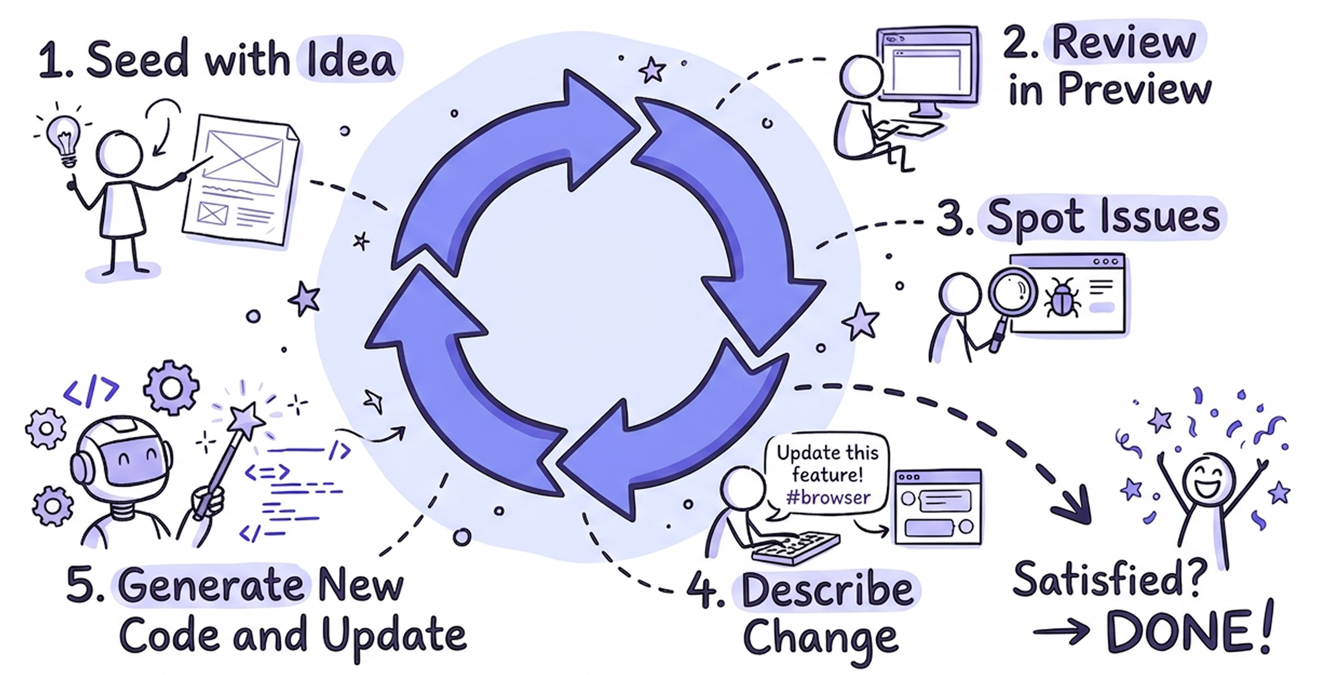
The loop works like this:
- Build — ask @solar to create or change a page
- Review — look at the result in the Simple Browser
- Spot issues — notice what's off (spacing, layout, missing elements)
- Describe the change — tell @solar what to fix, using visual context
- @solar updates — the page updates in the preview
- Repeat — keep going until you're satisfied
Most pages reach "demo quality" in 3–7 iterations. Don't aim for perfection on the first prompt — aim for a fast loop.
Giving @solar Visual Context
Describing what you see in words works, but showing @solar what you see works better. There are three ways to give visual context:
1. The </> Share with Agent Toggle
Before using any visual context features, you need to turn on sharing:

- Look at the top-right corner of the Simple Browser panel
- Find the
</>icon (it says "Share with Agent" on hover) - Click it to toggle it on
When this toggle is on, Copilot can read the content of your live preview. Without it, #browser and element selection won't have access to what you're seeing.
Turn this on once and leave it on for your entire session.
⚠️ Troubleshooting: If the toggle doesn't seem to work (e.g.
#browserreturns no content), try reloading the VS Code window: open the Command Palette (Cmd + Shift + P) and run Developer: Reload Window.
2. The #browser Tag
Type #browser anywhere in your chat message to attach a screenshot of the current preview to your prompt.
Example: "#browser the spacing between the stat cards is too tight — add more breathing room"
This is the fastest way to give @solar visual context. Use it when your feedback applies to the overall layout or appearance of the page.
3. The ↖ Add Element to Chat
For precise, element-level feedback, use the pointer tool:

- In the Simple Browser toolbar, click the ↖ pointer icon ("Add element to chat")
- Hover over the page — elements will highlight as you move
- Click the element you want to change
- The element is added to your chat — now type your change
Example: Click on a chart → "change this to a line chart with a gradient fill"
This is the most precise method. Use it when you want to change a specific component without ambiguity.
⚠️ Troubleshooting: If clicking elements doesn't add them to the chat, try reloading the VS Code window: open the Command Palette (
Cmd + Shift + P) and run Developer: Reload Window.
With vs. Without Visual Context
| Without context | With #browser or element selection |
|---|---|
| "make the header bigger" — which header? The page title? The AppBar? | "#browser make the page title in the header area larger and bold" — @solar can see exactly which element you mean |
| "fix the spacing" — which spacing? Between what? | Click the cramped cards → "add more space between these cards" — no ambiguity |
| "the colors are wrong" — wrong how? | "#browser the stat cards should use a lighter background, the current dark blue is too heavy" — @solar sees the current state |
Rule of thumb: If your feedback mentions position, layout, or appearance — add visual context.
Refinement Prompt Patterns
Organize your refinements by category. Here's what you can change and how to ask for it:
Layout & Spacing
| Observation | Prompt |
|---|---|
| Cards too cramped | "increase the spacing between the stat cards" |
| Content not centered | "center the form and limit its width to 600px" |
| Sidebar too wide | "make the sidebar narrower — about 240px" |
Data & Content
| Observation | Prompt |
|---|---|
| Table missing columns | "add email and status columns to the transactions table" |
| Wrong placeholder data | "change the mock data to use realistic merchant names and euro amounts" |
| Missing labels | "add labels above each stat card: 'Revenue', 'Users', 'Orders', 'Conversion'" |
Components & Interactions
| Observation | Prompt |
|---|---|
| Missing action | "add a confirmation dialog when clicking the Delete button" |
| Wrong component type | "change the revenue chart from bars to a line chart" |
| Need a filter | "add a search field and a status dropdown filter above the table" |
Responsiveness
| Observation | Prompt |
|---|---|
| Broken on mobile | "make this page responsive — stack the cards vertically on mobile" |
| Table overflows | "make the table horizontally scrollable on small screens" |
| Sidebar overlaps | "collapse the sidebar into a hamburger menu on tablet and below" |
Styling & Branding
| Observation | Prompt |
|---|---|
| Text too small | "make the page title 24px and bold" |
| Wrong icon | "change the stat card icons to TrendingUp, People, Receipt, and Euro" |
| Too much visual weight | "make the stat card backgrounds lighter and remove the drop shadows" |
Step-by-Step: 5 Iterations on a Dashboard
Here's what a real refinement session looks like, starting from a basic dashboard built in Module 2.
Iteration 1 — Fix layout and spacing
the stat cards look cramped — make them equal width with more spacing between them
What changes: Cards get even widths and consistent gaps. The page goes from cluttered to clean.
Iteration 2 — Add visual detail to cards
add icons to each stat card — use TrendingUp for revenue, People for users, Receipt for orders, and Percent for conversion rate
What changes: Each card now has a meaningful icon. The dashboard looks more professional and scannable.
Iteration 3 — Change the chart type (with visual context)
#browser change the bar chart to a line chart with a smooth curve and a light gradient fill below the line
What changes: The chart transforms from bars to a smooth line. Using #browser helped @solar see the current chart and apply the change accurately.
Iteration 4 — Improve the header (with element selection)
Click the ↖ pointer on the page title → make this title larger, add a subtitle with today's date, and add an Export button on the right
What changes: The header gets a clear hierarchy with a title, subtitle, and action button — a common dashboard pattern.
Iteration 5 — Make it responsive
make this page responsive — stat cards should go from 4 columns to 2 on tablet and 1 on mobile, the chart should be full-width
What changes: The page now works on any screen size. Test it by dragging the Simple Browser panel narrower.
Result: In 5 prompts (under 5 minutes), a basic dashboard becomes demo-ready.
Best Practices
- One change at a time — small, focused prompts produce more accurate results than "change everything at once"
- Always use visual context for layout issues —
#browseror element selection removes ambiguity - Review before prompting again — check the preview after each change; sometimes @solar nails it, sometimes it needs a correction
- Be specific about what, not how — say "make the title larger and bold" not "change the font-size to 24px and font-weight to 700" — @solar handles the implementation
- Name the element — "the stat cards", "the search field", "the revenue chart" — this helps @solar find the right component
- Iterate fast, don't overthink — if a prompt doesn't work perfectly, refine it rather than trying to craft the "perfect" first prompt
Common Mistakes to Avoid
| Mistake | Why it fails | Instead… |
|---|---|---|
| "Make it look better" | Too vague — better how? | "Add more spacing between sections and make the title larger" |
| Changing 5 things in one prompt | @solar may miss some changes or apply them inconsistently | One change per prompt, verify each |
| Describing everything from scratch | Wastes context; risks losing work | Describe only what you want changed |
Not turning on </> toggle | #browser and element selection won't have page context | Turn it on once at the start of your session |
| Skipping the preview between iterations | You miss issues that compound with each change | Always review before the next prompt |
🏋️ Exercise
Hands-on practice for Module 3
📝 Module Quiz
Test your knowledge of Module 3 concepts.
Take the Quiz